Make an image better by making it worse
Just a quick reflection on images authenticity and fakeness.
While I´ve been spontaneously curating a collection of iPhone images taken during the last years, I´ve been thinking a lot about using images different qualities or lack thereof. Looking through my iPhone XMax (from 2018) images, I couldn´t help but notice a disappointment in the material, not being on par with my regular Sony A7iii full-frame images. And then I realised that this disappointment is completely unnecessary because my iPhone images are not and are not trying to be Sony A7iii type images. They´re just not. Now, in all honesty, iPhone images can be quite bland in their normal screen “gallery-form,” but I still think that we can put them in an art context and make something interesting without pushing the material too far for its own reach. To demonstrate, here is a clever metaphor that I´m really proud of: A chef can´t make the world’s finest risotto with porridge rice, but he can still make a beautiful ris a la malta.
Let's break it down.

Image quality is something that is always a concern for photographers. At least in my part of the community, I often see that there´s a drive among photographers to elevate an image to a “higher standard” than it actually is in its raw format. Now, this is entirely speculative in terms of the technical “correctness” of an image, not taking into account the different affective or emotional experience we might have with an image. Think National Geographic or fashion magazines. But in these terms, a relatively “bad” image is in postproduction manipulated to be “better,” and by better I mean sharper, more vivid colors, less grain, and to the untrained eye a more “professional” image. Now, I have an issue with this, although I have been quality of this before, it does create a certain “fakeness” to the image, and it tries to be more than it is. Many of these attempts, unfortunately, land in the “uncanny valley” of cheaper low-sensor images wanting to look like the result of a full-frame mirrorless camera. It just doesn´t work.
Instead, I believe that the image quality of, let’s say, an iPhone image could be taken in a completely different way. Instead of pulling it in the direction of a high-polished fine art image, try making it “worse”. I mean, let’s face it, you're not going to want to print a noisy iPhone image in a 1 x 2 metres format, but you´d want to do that with a Hasselblad medium format 102 megapixel image. So don’t do it, and don’t reach for that aesthetic either. Make it something different. Print it smaller.
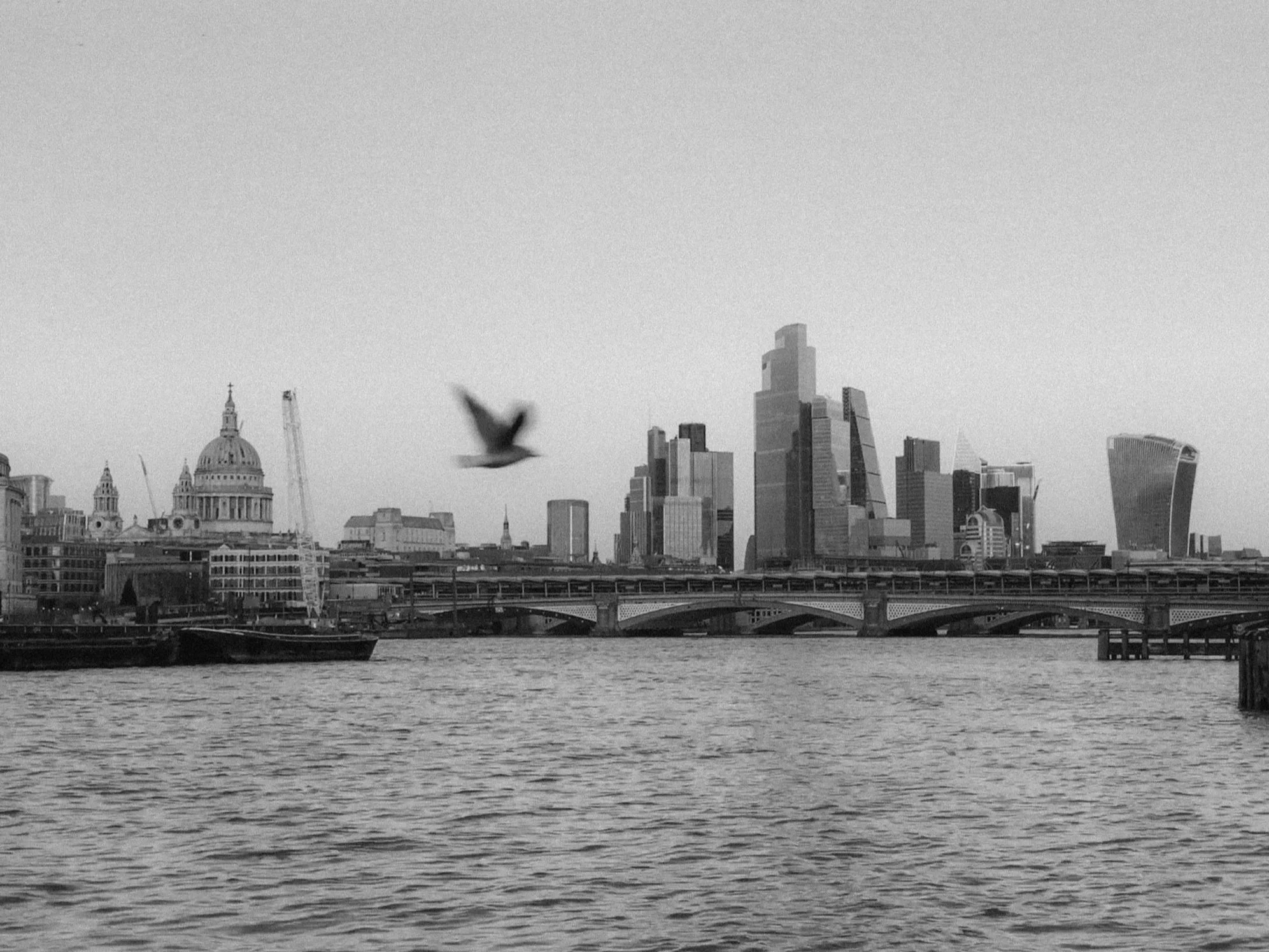
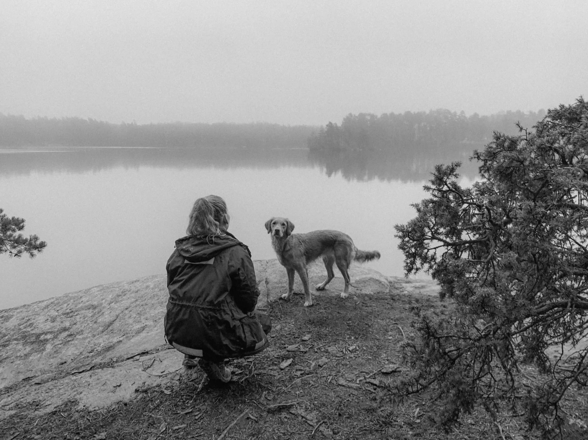
One of the solutions could be to emphasize the characteristics that one may initially want to cover up. Make it more grainy. Make it less sharp. Make it more blurry. Make the colors less saturated. Hell, make it black and white, we all know that the colors in mobile phone cameras completely sucks in comparison to mirrorless cameras with real glass. In this way, you're using the images’ lack of technical quality to make something more impressionable and impactful rather than covering them up.
I think that the same principle can apply to many different areas as well, like in filmmaking, for example. I remember editing a small nature/expedition type documentary I shot and in the process of shooting, stabilization seemed to be thrown out the window. So there I was, trying to stabilize the hell out of these handheld shaky images, trust me, it was nuts. But, instead of making it a National Geographic North Face TV commercial with silky drone footage. I used this shakiness to my advantage. Making it more of a POV type story and more mysterious, not as polished or extravagant as the initial plan was. Then the story you´re trying to tell matches the visual language of the material itself, creating authenticity. And for me, the same goes for photography.
So in conclusion, sometimes an image can benefit by making it worse.